

How to Keep Instagram Carousel Slides Perfectly Aligned
One of the easiest ways to make an Instagram carousel feel unpolished is slight slide misalignment.
Even small shifts between slides become noticeable when users swipe:
edges jump
lines don’t continue cleanly
faces or text shift unexpectedly
continuous images break apart visually
Most of these problems come from the same mistake:
treating carousel slides as separate images instead of one composition.
This guide explains how to keep Instagram carousel slides properly aligned and avoid the most common cropping issues.
Why carousel alignment matters
Instagram carousels are experienced as movement.
When someone swipes:
the eye expects continuity
visual rhythm matters
even tiny inconsistencies become obvious
This is especially important for:
panoramic images
before/after comparisons
product sequences
portfolios
educational carousels
branded campaigns
Alignment problems reduce perceived quality surprisingly quickly.
The most common alignment mistake
Many workflows crop each slide individually.
This creates several problems:
inconsistent framing
mismatched edges
uneven spacing
small scaling differences
Even if each individual image looks correct, the sequence itself feels unstable.
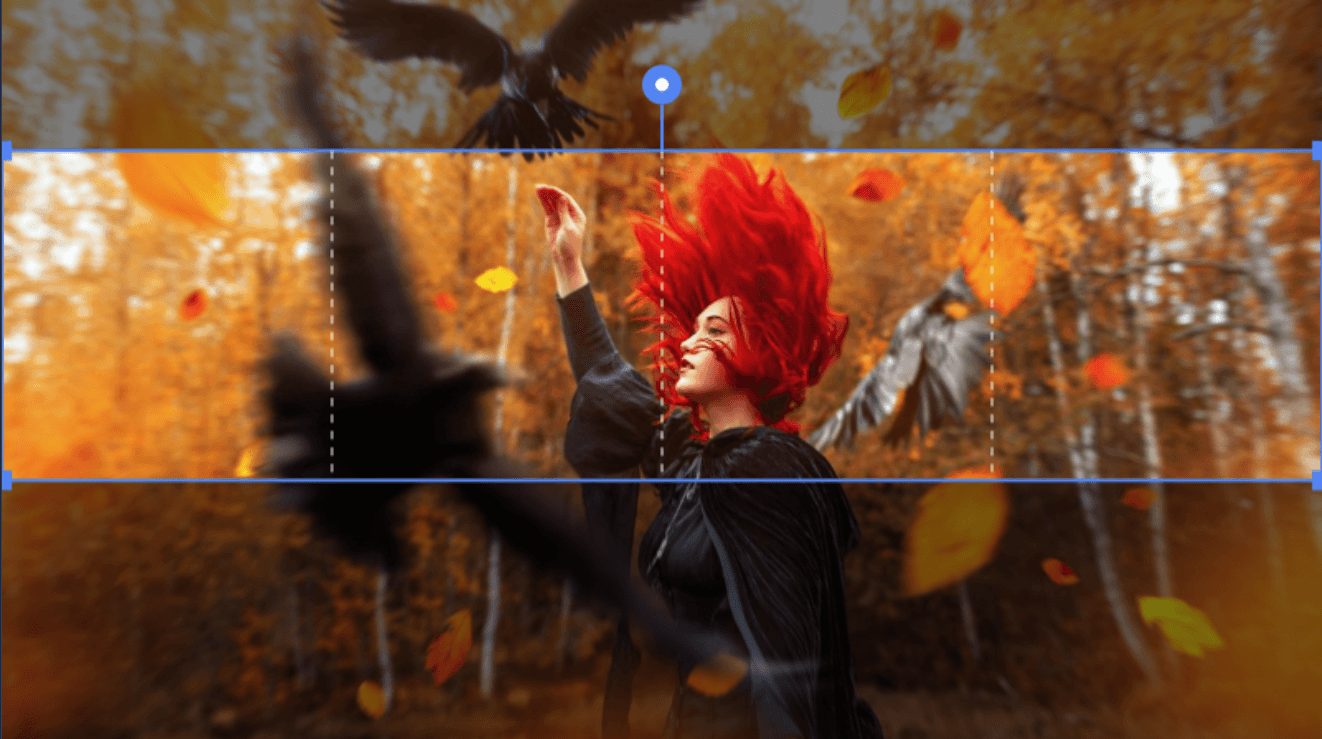
The correct approach: crop once, split later
The most reliable method is to:
treat the carousel as one wide image
adjust the composition once
split it into equal-width slides afterward
This keeps:
edges aligned
spacing consistent
framing stable across the entire carousel
It also reduces repetitive manual work.
Choose the slide count first
Before adjusting the crop:
- decide whether the carousel will use 2, 3, 4, or more slides
This matters because:
the total width changes
slide boundaries move
composition shifts slightly
Changing slide count after cropping usually causes alignment problems.
Leave safe space near slide boundaries
Important visual elements should not sit directly on slide edges.
Good practice:
leave small margins near boundaries
avoid splitting eyes, faces, or text
keep important lines away from seams
The cleaner the transitions, the smoother the swipe feels.
Use consistent dimensions
Instagram carousel alignment depends on equal sizing.
Recommended slide dimensions:
Square: 1080 × 1080
Portrait: 1080 × 1350
Examples:
3-slide square carousel → 3240 × 1080
4-slide portrait carousel → 4320 × 1350
Mixed dimensions often create scaling inconsistencies.
Larger carousels require more planning
Instagram supports longer carousel sequences than most workflows are designed for.
For larger continuous carousels:
plan the composition before cropping
maintain equal-width divisions
avoid changing crop ratios mid-sequence
Grid-based splitting can help maintain alignment across larger sets when used intentionally.
Why many editing tools struggle with alignment
Most editors are designed for:
image editing
layout creation
visual composition
Carousel alignment is usually a secondary feature.
As a result:
slides are often handled independently
cropping becomes repetitive
continuity depends heavily on manual precision
This is why dedicated cropping workflows tend to produce cleaner results.
A cleaner workflow
A reliable carousel workflow usually looks like this:
edit images first
decide final slide count
crop the carousel as one composition
split into equal slides
export once
Separating editing from cropping reduces mistakes significantly.
MintyCrop is designed around this exact workflow: unified carousel cropping, clean splitting, and consistent exports without editor overhead.
Try now free at mintycrop.com
Final takeaway
Perfect carousel alignment is less about design skill and more about workflow structure.
The key is simple:
treat the carousel as one composition first, and individual slides second.
Once the workflow is built around that idea, alignment problems become much easier to avoid.